Most of us here are die-hard supporters of football clubs. Every aspect of those clubs brings pride to us. We love the nicknames, the chants, the colours, the kits, the stadium, all of it.
One such aspect is the club crest. For some, the club crest is even more recognisable and iconic than the name of the club itself. It adorns the kit, the flags and the banners. We have all tried sketching it on our schoolbooks, had them on our phone wallpapers or worn it on our shirts.
Click here to jump straight to the list of reimagined Premier League crests.
This is not the case in just football, but all brands or groups in general. From the local pubs to ruling government parties, from Instagram influencers to giant global brands, everyone knows the importance of a good logo or crest.
These logos and crests aren’t always the same through the years though, they evolve and grow, keeping in line with the time’s trends and needs. Most logos go through complete overhauls and some go through just minor changes. You can recognize many of the trends through the ages, one such recent trend is to simplify them.
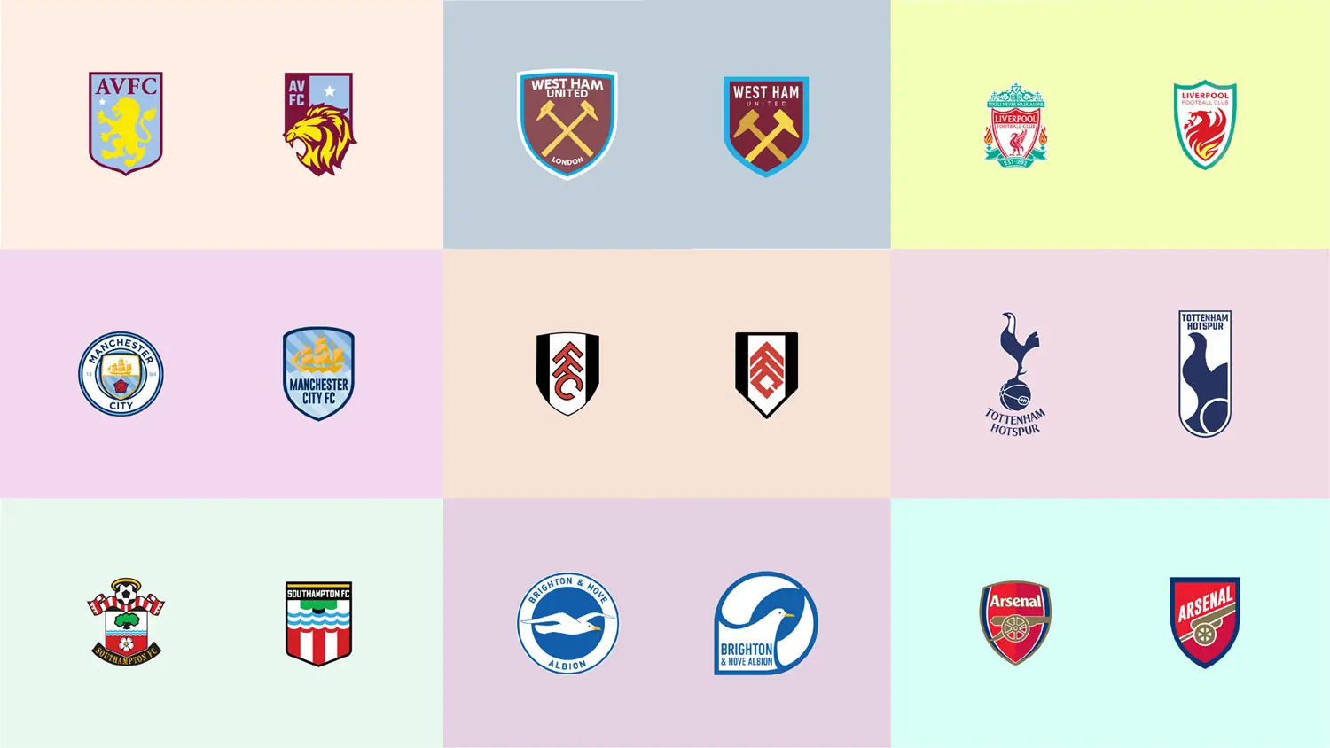
The digital age has bought these logos from giant banners to tiny Instagram account profile pictures. This has led to various changes such as simplifying and flattening logos and getting rid of gradients. Most global logos have become cleaner and minimalist recently, however, an entire world of logos have just avoided this change, the world of football.
Most football crests have defied current trends, even though they had gone through significant changes to evolve in past years. I’m a big fan of football, especially the Premier League. I’m also an art director and graphic designer.
So, I decided to redesign all the Premier League crests, trying to imagine what they would look like if they went through a modern overhaul. Most would get simplified, lose elements, have different typography.
The crest that inspired me to undertake this project was the Juventus crest, which went through a complete change and what we got was a very minimalist modern crest.
Now design, like art, is a matter of taste and is subjective. Football fans aren’t exactly known to be great at dealing with crest changes, this is clear by the response every time their favourite club’s crest has gone through a change. However, I hope you’ll humour me with my little project.
If you like what you see or you don’t, thankfully you don’t have to resort to mailing letters to the editor, you can just drop me a text on Instagram. Modernisation! Amazing isn’t it?
Premier League Crests, Club by Club
Arsenal
Aston Villa
Burnley
Brighton & Hove Albion
Chelsea
Crystal Palace
Everton
Fulham
Leeds United
Leicester City
Liverpool
Manchester City
Manchester United
Newcastle United
Sheffield United
Southampton
Tottenham Hotspur
West Bromwich Albion
West Ham United
Wolverhampton Wanderers
Shadab Wajih is an award-winning art director, graphic designer and an illustrator based in Miami, US. Besides his design and advertising work he also prides himself in his FIFA managerial skills. You can see more of his work, contact or complain to him on his Instagram: @snikt13
Add Sportslens to your Google News Feed!