I always envy designers who get to design logos and crests for clubs with such cool names as “Arsenal FC”. The London based club, however, wasn’t always named just Arsenal FC.
Arsenal FC was formed in 1886, as Dial Square, which was the heart of the Royal Arsenal complex. They soon adopted the name of the whole complex and got known as Royal Arsenal FC. Royal Arsenal then re-named themselves for a second time as Woolwich Arsenal in 1893.
The third change of name came in 1914 as they became “The Arsenal”. They finally dropped “The” shortly afterwards to be known as Arsenal FC and the name has stuck around since.
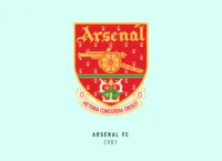
Arsenal FC’s first crest included three cannons viewed from above, pointing upwards. They dropped 2 of them to feature just one in 1922. After fighting a long legal battle with a street vendor selling fake Arsenal merchandise, they decided in 2002 to make a much more modern, copyright-friendly version of the crest.
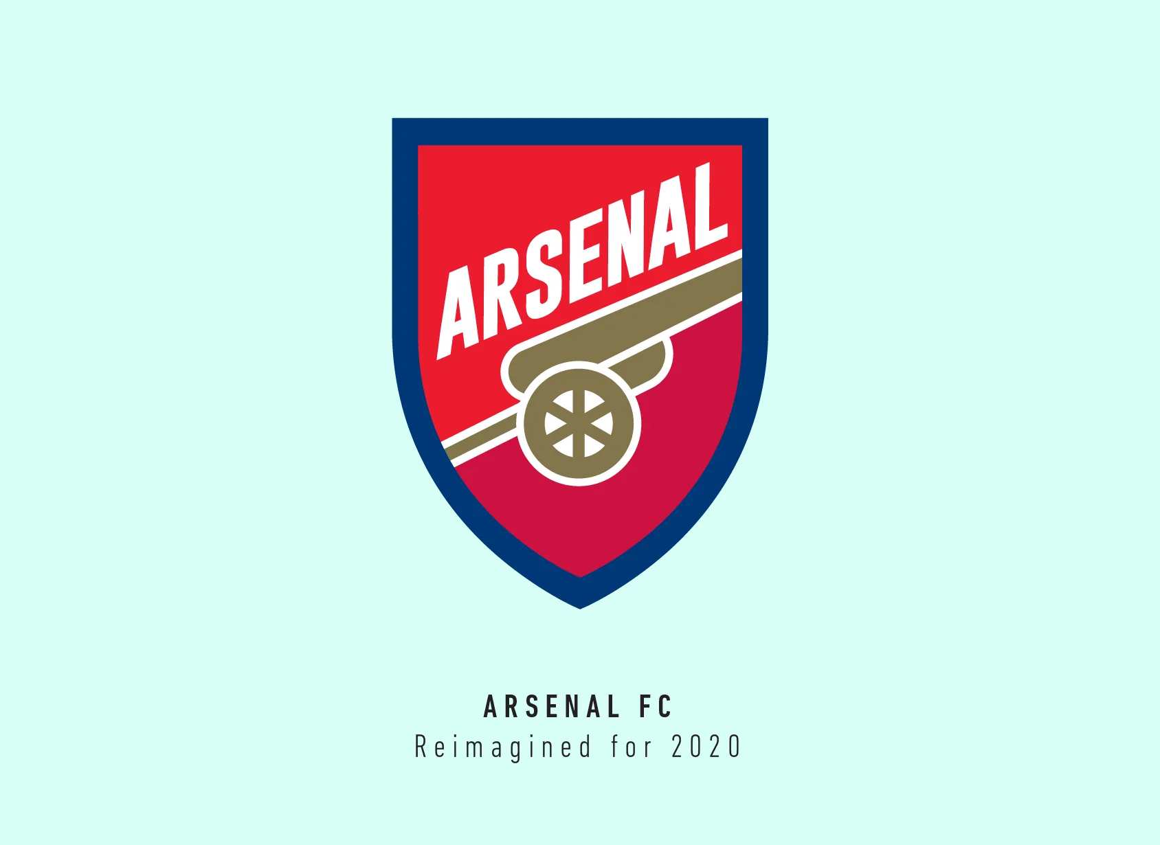
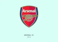
This basically was the version of the crest we know Arsenal FC for. It features a single cannon facing east, with the name written in a clean san-serif font above it.
Before starting the redesign process, I had never realised how the wheel of the cannon was right in the centre of the crest. I thought that is one part of the crest which I should keep as is, apart from the iconic shield shape. I did flatten the shield to keep up with today’s design trends. The current Arsenal has red and a shade of crimson as its main colours split right down the middle.
I used the same two colours but split them with the cannon. I had to shift the cannon a little down to make space for the name since it takes more space because of being diagonal.
It honestly took me a lot of versions before landing with this one, adjusting and readjusting the text and cannon till it felt visibly balanced with enough breathing space around it. As a result, I had to make the cannon wheel slightly smaller too.
I wanted to channel Arsenal’s youthful energy with this version of the crest. A flat crisp crest with bold typography just seemed to fit with Arsenal’s philosophy and legacy.

This article is part of the Premier League 2020 Crests series.
Shadab Wajih is an award-winning art director, graphic designer and an illustrator based in Miami, US. Besides his design and advertising work he also prides himself in his FIFA managerial skills. You can see more of his work, contact or complain to him on his Instagram: @snikt13
Add Sportslens to your Google News Feed!