Younger or recent football fans might be extremely surprised to know that there was a time when Leeds United was one of the best clubs in England, under the management of Don Revie in the 60s and 70s.
Leeds United FC was formed in 1919. They had a predecessor club, called “Leeds City” formed in 1904. This club was forcibly disbanded by The Football league in 1919. That’s when Leeds United FC was born to replace them.
Since then Leeds United has won the league three times.

Leeds United FC has had a lot of crest overhauls over the decades, each one more different than the last.
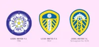
The first crest appeared in 1934 and was an adoption of the coat of arms of Leeds. This was followed by a perched owl in 1964.
Another major change came in 1973 when they introduced a minimalist stylized version of the letters “LU”. This came to be known as the iconic “smiley” crest and variations of it stayed on till 1978.
Another change was the introduction of a peacock in the crest, followed by one crest with a white Yorkshire rose in 1984. The current crest was introduced in 1999. However, Leeds United FC tried to do another major overhaul in 2018 which was met with widespread criticism, which led them to go back to basically the same crest they had before.
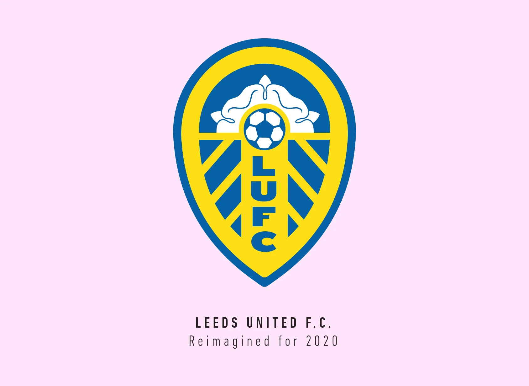
This crest features a football and the Yorkshire rose on a shield with the letters “LUFC” placed vertically down the middle.
The current crest was actually quite good even by modern standards, but it had some flaws, mainly the typography and the flower. I thought I’ll adopt the shield shape and orient it towards the football in the centre.
I wanted to simplify and increase the size of the Yorkshire rose so we can actually see it, even if it meant cutting it a bit. I reduced the number of stripes and made them bolder to get rid of the little triangles which existed in the original crest. I also changed the typography to fit with modern trends and look bolder.
Leeds United FC is a club that has been away from the Premier League for far too long. A club such as theirs deserves to come back with a bang with a new crest. They are not here just to talk history, but to make history as well.
This article is part of the Premier League 2020 Crests series.
Shadab Wajih is an award-winning art director, graphic designer and an illustrator based in Miami, US. Besides his design and advertising work he also prides himself in his FIFA managerial skills. You can see more of his work, contact or complain to him on his Instagram: @snikt13
Add Sportslens to your Google News Feed!