Back in 1974, Brighton was facing a heated derby match against their rivals Crystal Palace FC. At the time the club’s supporters were known as the dolphins and their crest even featured the mammal.
During the game, Crystal Palace supporters started yelling “Eagles, Eagles” to which the Brighton supporters retorted with “Seagulls, Seagulls”. Thus, the dolphins were forever replaced by the seagulls. For the club I mean, not in the animal kingdom.
Brighton & Hove Albion FC was founded in 1901. They had actually replaced a defunct club, known as Brighton & Hove Rangers, in the Southern League.
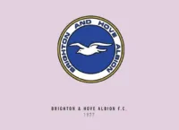
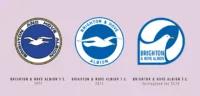
Like mentioned above, the Seagulls didn’t have a seagull in their crest until 1974. Initially, the crests featured the coat-of-arms of the twin towns of Brighton and Hove. However, once the seagull had made its debut it featured in almost all the crests that were to follow.
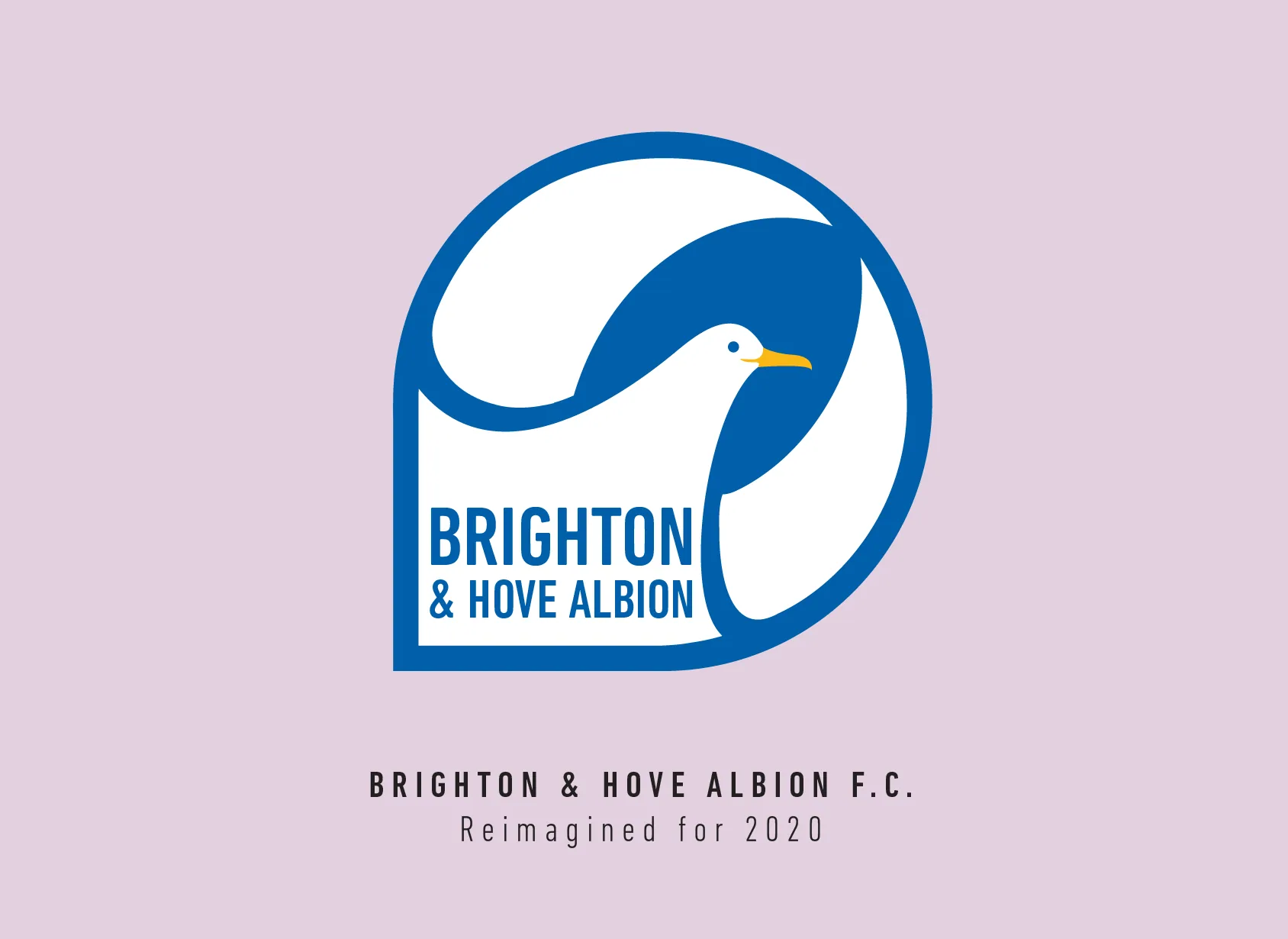
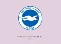
The crests of Brighton were actually quite ahead of their time, with very simple designs that worked really well with the kit overall. The current version features just a white seagull on a blue round shield with the long name of the club occupying the top and bottom.
I loved the fact that the wings of the seagull kind of broke through to the foreground adding depth to it.
The first thought of most designers, including me, redesigning this crest would be to take the seagull, flatten it up and fill it out within the circle boundaries. I eventually tried to make it a little different from keeping it just a basic circle.
I made the seagull first within a round boundary and then proceeded to pull out the edge where its tail is supposed to be. I used that space to fit the name of the club. Brighton and Hove Albion can be quite a mouthful, and I had to resort to using extremely condensed typography to fit it all in.
The end result seemed to be quite legible, which was enough for me.
Amongst the English crests with their multiple elements squeezed into a tiny crest, it was nice to see how through the years Brighton supporters have been content with a beautifully simple seagull on a round crest. It was that simplicity that I tried to retain in this crest redesign.
This article is part of the Premier League 2020 Crests series.
Shadab Wajih is an award-winning art director, graphic designer and an illustrator based in Miami, US. Besides his design and advertising work he also prides himself in his FIFA managerial skills. You can see more of his work, contact or complain to him on his Instagram: @snikt13
Add Sportslens to your Google News Feed!