Tottenham Hotspur FC is one of the bigger clubs in England, boasting top managers, top players and top documentaries. The current squad has been on the verge of greatness many times during the past few years and it feels like it’s only a matter of time before they have the trophies too.
Tottenham Hotspur FC started as a club in 1882 and were the first club in the 20th century to win the League and FA Cup Double during the 1960–61 season.
They are named after Harry Hotspur, who got his nickname as he dug in his spurs to make his horse go faster in battle. The Spurs are also associated with fighting cocks.
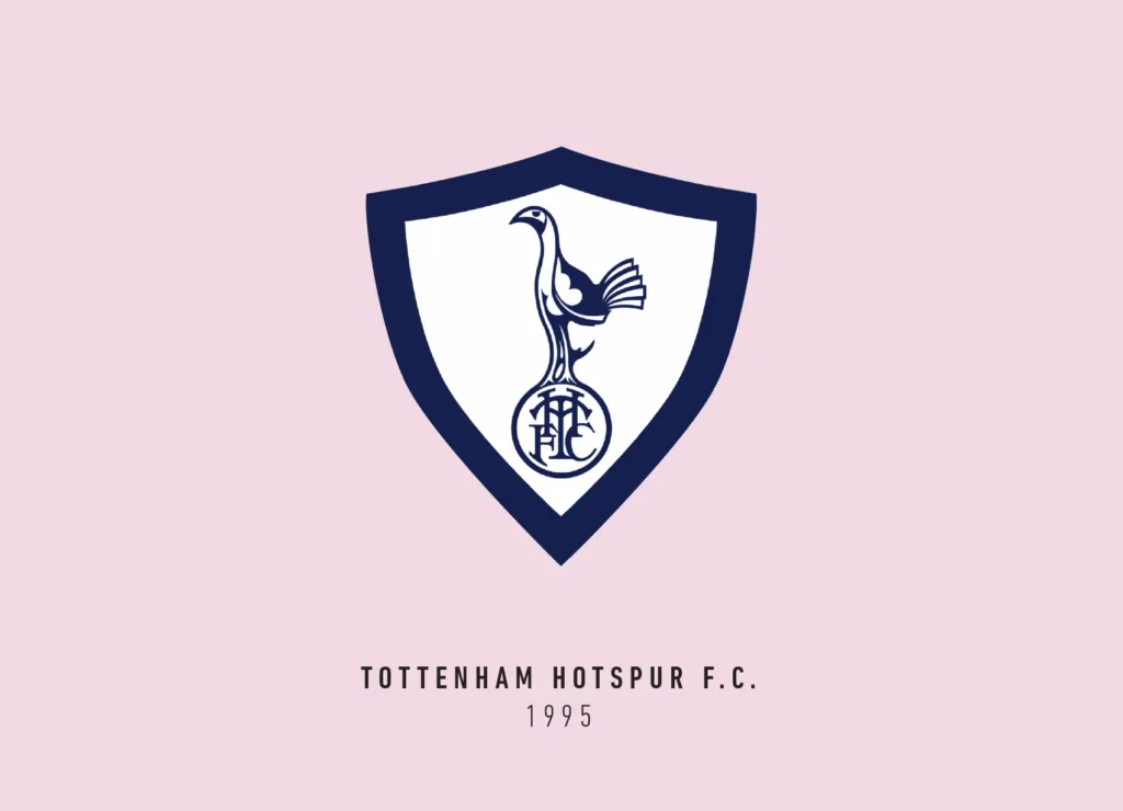
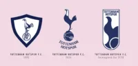
That is probably why a cockerel has been the chief subject of their crest over their entire history. The crest once had a cockerel within a shield but was later changed to the cockerel sitting on a ball in the late 1960s.
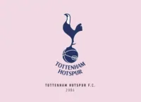
This is basically the same crest we have nowadays. In a bid to modernise the club went through a rebranding in 2006. The cockerel looks sleeker now and is a stylized version of the older ones. I like the fact that it’s just two colours.
I just wished the current crest would feel more like a complete lockup. Right now, the text seems to be a bit “floaty” below it.
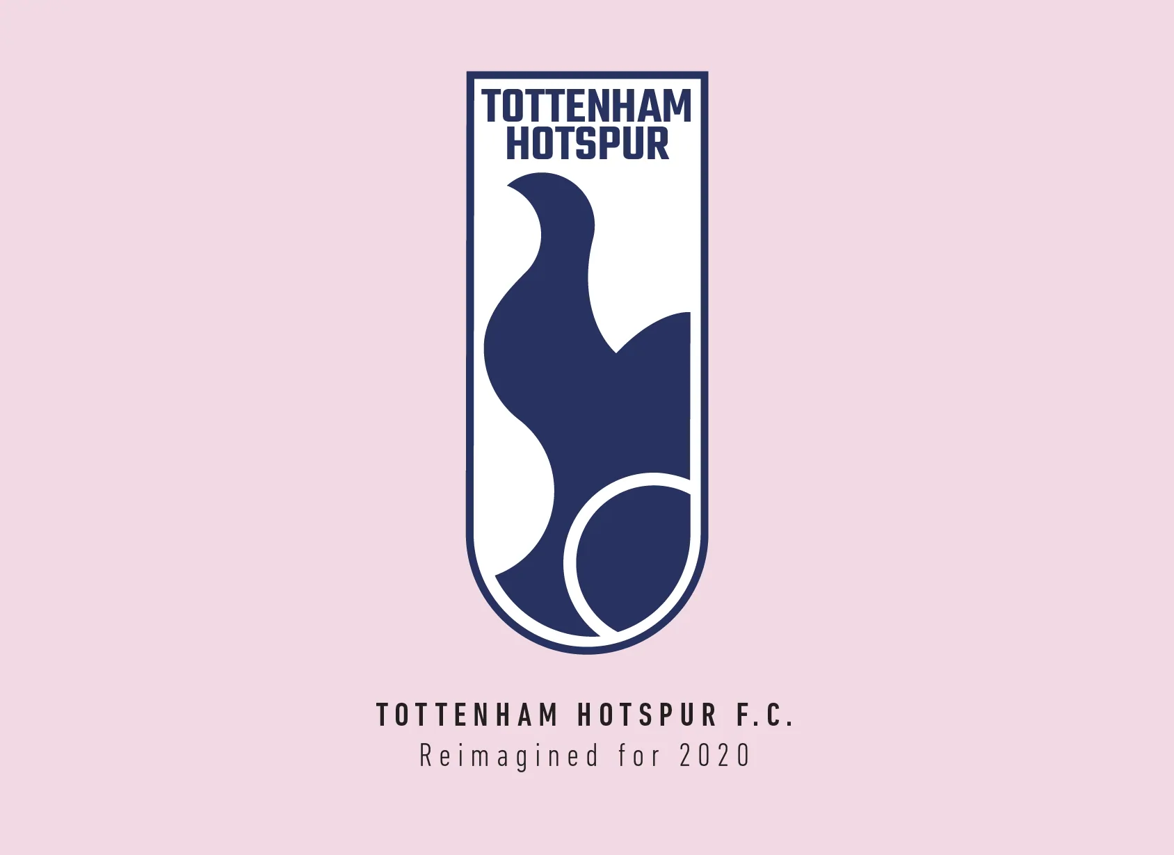
I started redesigning this crest but first starting with the cockerel. Since the current one is so curvy, I worked to enhance those curves and make it more fluid. The redesigned cockerel is made entirely from intersecting circles.
This gave me the advantage of placing the ball right next to its feet. I felt the cockerel didn’t really have to stand on the ball necessarily. In this version, it feels more playful almost as if the cockerel is mid-action.
In my mind, I also see the ball as a flaming comet along with the abstract curves, which felt like a nice little bonus image hidden within. Most of the previous crests had a shield so I proceeded to encase this on one too.
I tried different versions where the shield shape wasn’t outlined but just implied by enforcing a lockup with the text, but it probably wouldn’t have looked as good on a shirt that way. This is probably the narrowest crest I have created, which felt weird but then again, the current crest is quite vertical too.
It’s good to see clubs like Spurs who keep refining their logos through the years and have these modern crests already. I still like reworking them as part of my little project since logo design is as subjective as any other art form and there is always room for change.
This article is part of the Premier League 2020 Crests series.
Shadab Wajih is an award-winning art director, graphic designer and an illustrator based in Miami, US. Besides his design and advertising work he also prides himself in his FIFA managerial skills. You can see more of his work, contact or complain to him on his Instagram: @snikt13
Add Sportslens to your Google News Feed!