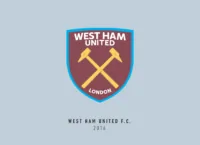
Not all clubs have been late when it comes to bringing their crest to the modern era. West Ham United FC realized that back in 2014 itself. The current crest may be one of my favourite existing ones out there, bringing a much-needed simplicity to the Premier League.
West Ham United FC was founded in 1895 as Thames Ironworks originally but they soon changed it to West Ham United in 1900. The club was formed by members of a local shipyard and that is represented by the crest even today.
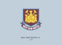
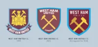
The West Ham United crest actually started off very simple and similar to the current one we have. The first iteration was made in 1923 and consisted of just two crossed burgundy hammers enclosed in a circular frame and placed on a light blue crest.
The hammers were there to represent the “Iron” part of the club. They definitely added some “badass” points to the crest and I’m glad they never left the crest since. It wasn’t until 1968 that we saw the castle appear on the crest for the first time. This was actually the Anne Boleyn castle, and there are many reasons why this was included but no one really knows for sure.
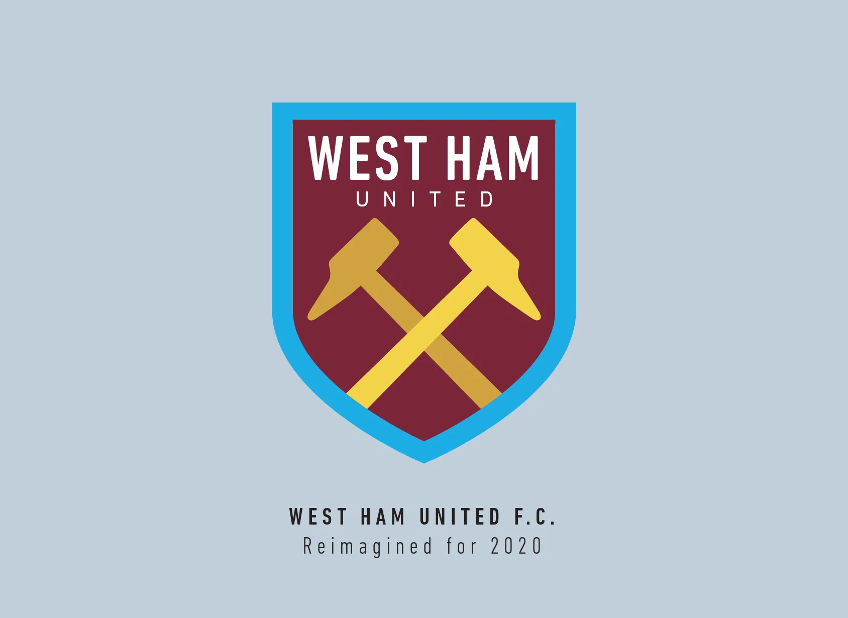
In 2014 though, the castle was voted away by the fans as we saw the current version of the crest appear for the first time through a fan vote, resulting in the minimalist crossed hammer crest.
Redesigning the West Ham United crest was a breeze honestly. This was the first crest I decided to redesign as part of my little project. The hammers gave a feeling of utter dominance which I’m sure the fans of the club appreciated, even if it didn’t always translate to the pitch.
I closed in on them as I felt the handles or arms of the hammer really didn’t need to be shown. I removed the letters T.I.W. which appear on the original, referencing Thames IronWorks. Fun Fact: The shape of the original is not just a shield, but it’s supposed to also resemble the hull of HMS Warrior, the most famous ship built by the Thames Ironworks.
Pretty neat, so I kept it very close to the same shape, just flattened it a bit. There is a sense of irony in the fact that I spaced out the letters in United, but it strangely seems to add more weight to it.
I didn’t change the crest a lot when I redesigned it, but that just is a testament to how good and ahead of its time the current crest actually is.
This article is part of the Premier League 2020 Crests series.
Shadab Wajih is an award-winning art director, graphic designer and an illustrator based in Miami, US. Besides his design and advertising work he also prides himself in his FIFA managerial skills. You can see more of his work, contact or complain to him on his Instagram: @snikt13
Add Sportslens to your Google News Feed!