The black and white of Newcastle United FC is pretty iconic, though they didn’t actually use those colors until 1894. The first home kit was actually a plain red shirt with white shorts and socks.
They eventually chose black and white stripes because those were not associated with either of the two teams United were merged from.
Newcastle United FC was actually founded in 1892 by merging two clubs, Newcastle East End and Newcastle West End. Ever since Newcastle United has been quite successful, staying in the top tier of English football for most of their history.
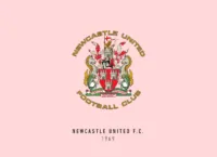
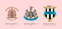
The crest design of Newcastle United FC has gone through complete overhauls multiple times since they were formed. One of the more distinct ones was the one they had in 1983 with bold letters “NUF” forming a circle above a lone magpie.
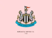
The current crest has a lot of elements within itself. Starting from the top there is a lion with a flag depicting the St. George’s Cross atop a tower that might be the Castle Keep signifying the Norman era. On both ends are seahorses which are representing seafaring heritage.
The club’s iconic black and white stripes are right in the centre with the club’s name on a banner below.
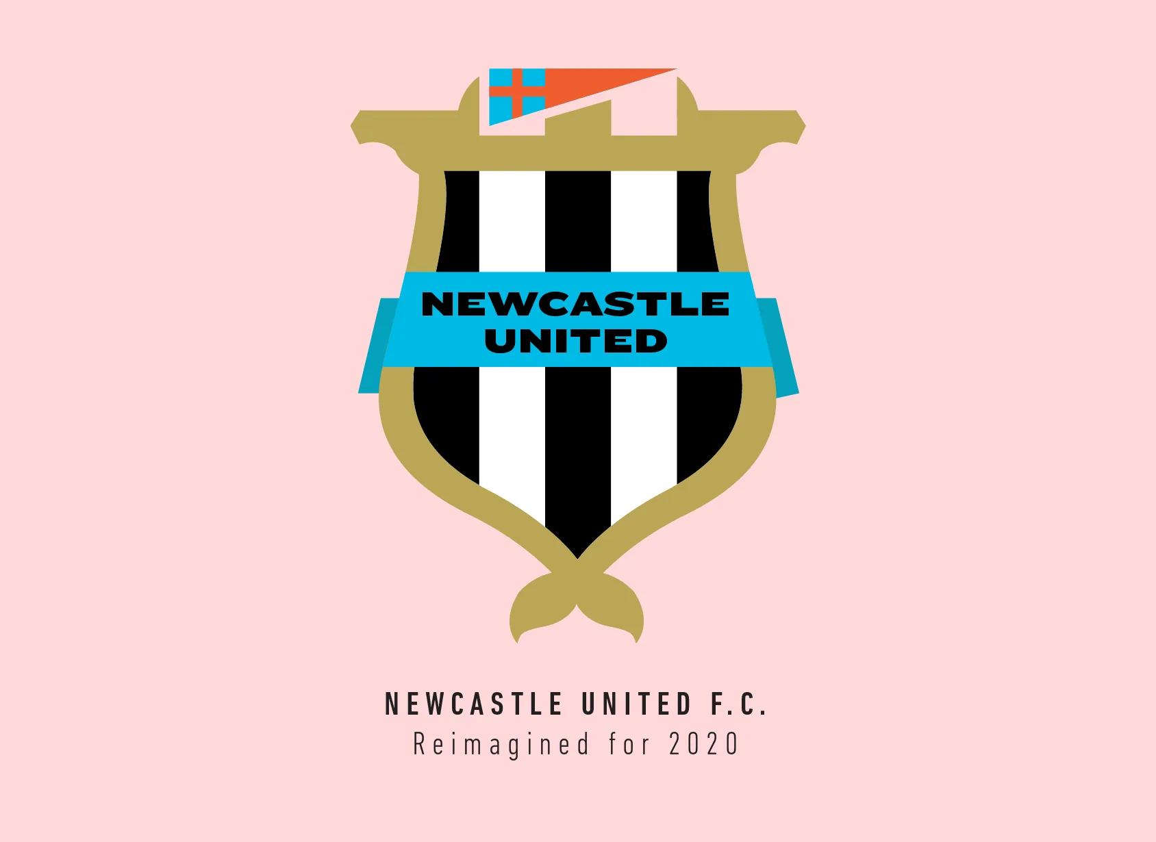
In almost all the Premier League logo redesigns I have done, I have removed elements. I thought when I started with Newcastle United’s crest that I’ll probably be removing most of them, considering the current crest is so full of them.
Towards the end though I actually ended up subtly including almost all of the previous crest’s elements. I began with using the curves of the seahorses to define the shield, I added a little tail and the heads on the sides to further imply that the seahorses are still there, just a little more hidden.
I stretched the stripes within the shield to the outside to represent the tower, however after I added the flag, I feel it might not be that clear anymore. I tried to include the lion, but the flag alone just fit so well I had to keep it this way. The centre of the crest was way too empty, so I put the banner with the name smack in the middle. I like the blue and how it adds flavour to the crest.
This is probably one of my more “experimental” crest redesigns. I think what makes it really stand out is that specific shade of blue. It almost feels like a treasure hunt to find all the references to the previous version of the crest.
This article is part of the Premier League 2020 Crests series.
Shadab Wajih is an award-winning art director, graphic designer and an illustrator based in Miami, US. Besides his design and advertising work he also prides himself in his FIFA managerial skills. You can see more of his work, contact or complain to him on his Instagram: @snikt13
Add Sportslens to your Google News Feed!