Most clubs have worked to simplify their crests and keep it to just a few elements in recent years. Burnley FC is definitely not one of those clubs.
Burnley FC was formed in 1882, being one of the earlier English football clubs. It was actually formed by members of the Burnley Rovers, a rugby team. It was surprising to me how many clubs started with as offshoots of other sports clubs.
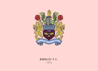
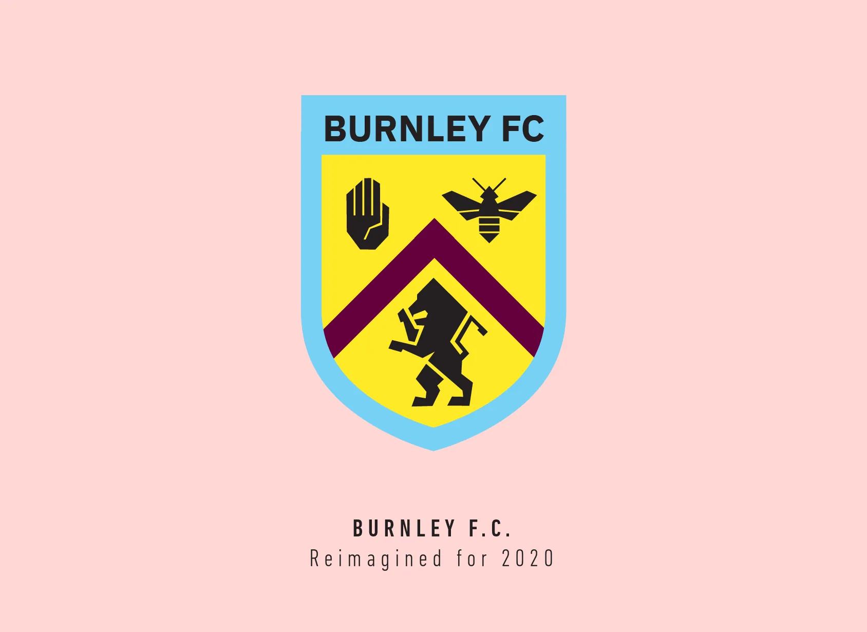
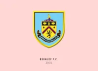
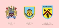
Now for that crest. Burnley FC started off with using the Royal Arms as a crest. They only got their first actual crest in 1969 when they used a vertical “BFC” monogram. The current crest has tons of elements within it and is based on the town’s coat of arms.
Let’s start from the top, where there is a stork which represents the Starkie family, who were prominent in the Burnley area. The stork is holding a Lacy know in its mouth, which is the badge of the de Lacy family, who held Burnley during medieval times. The stork is standing on a hill (the Pennines) with cotton plants—which represents the cotton making heritage of the town.
Oh, and there’s much more. The hand is based on Burnley’s motto, “Hold to the Truth”, derived from the Towneley family. The two bees refer to the town’s “busy ambience” and the saying “as busy as a bee” but also allude to the former Bee Hole End at Turf Moor.
The zig-zaggy band is the River Brun, which runs through the settlement. The lion represents royalty and hints to Prince Albert Victor’s visit in 1886.
That was a lot to squeeze into one crest, yet that’s how Burnley FC likes their crest. I wasn’t going to get rid of all of it, but I did have to let go of the stork (sorry Starkie family).
I started with the shield and made the River Brun line just straight. I used that as a guideline and fashioned the lion’s mane around it. I used the same jagged edges and angle to develop the rest of the lion’s body, aligning its mane, paws and tail to the river.
I did the same with the hand and reduced the bees to just one, aligning its wings to the river. I tried several combinations, switching up blue, claret and yellow until the one that made the most sense and seemed unique was having blue and yellow as the main colours and claret being used for the river line.
I actually had a lot of fun working on the Burnley FC crest. It feels very strange to have 3 seemingly random elements within a modern-day logo but because of the colours you can identify at a glance that this is Burnley’s crest.
This article is part of the Premier League 2020 Crests series.
Shadab Wajih is an award-winning art director, graphic designer and an illustrator based in Miami, US. Besides his design and advertising work he also prides himself in his FIFA managerial skills. You can see more of his work, contact or complain to him on his Instagram: @snikt13
Add Sportslens to your Google News Feed!