Liverpool FC is going through a textbook definition of a revival era. For many years it was historically the best team in English football. We all grew up with the stories of their victories, and recently we are witnessing them again.
After winning the Premier League 19 times, they are catching up to their immediate rivals Manchester United, who have won 20.
Liverpool FC was formed in 1892. Most fans will know about their history being tied to another club. Liverpool F.C. was founded because of a dispute between the Everton committee and John Houlding, then club president and owner of the land at Anfield.
After eight years at the stadium, Everton relocated to Goodison Park in 1892 and Houlding founded Liverpool F.C. to play at Anfield.
In fact, their original name was “Everton Athletic”. This is the reason why Everton FC have had a bitter rivalry with Liverpool FC, otherwise known as the “Merseyside derby”.
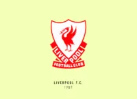
Liverpool FC has one of the most ornate crests in the game today, but this wasn’t always the case. Some of their older crests have featured just the Liver bird on a shield. If you’re wondering why you can’t find the Liver bird in your zoology books, it’s because it’s a fictional bird which is the symbol of the city of Liverpool.
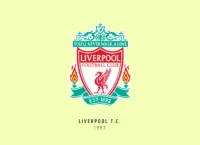
The bird was adopted to the badge and has been the most prominent symbol for the club crest. The current official crest has the Liver bird on the shield with the date below it. The flames on either side are in remembrance of the Hillsborough disaster, which shocked the football world in 1989.
Adorning the top of the crest are the famous words “You’ll never walk alone” from their most famous anthem. However, recently the club uses a much-simplified version without a shield and with the letters “LFC” on their kit.
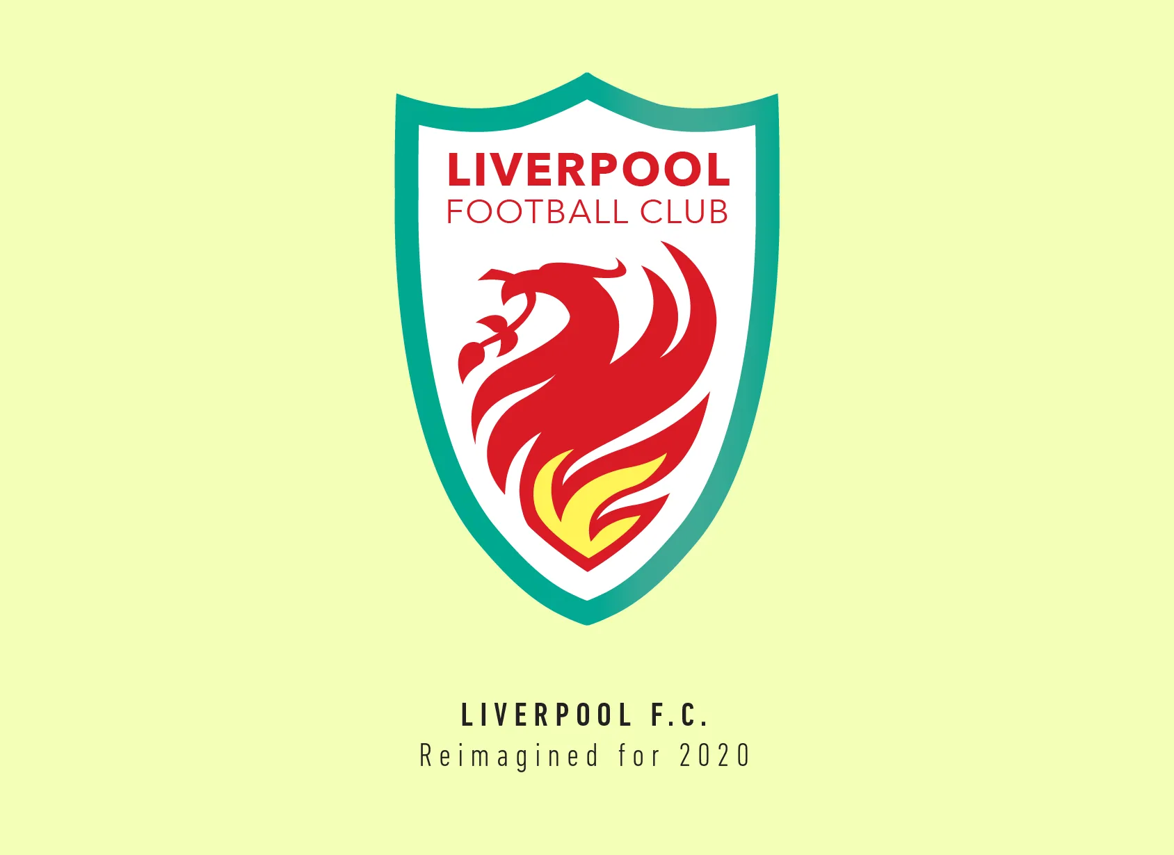
I wanted to do something different with this crest, I took the liver bird and adopted it into the shape of the shield, by abandoning its legs and focussing on just its head.
I wasn’t going to do it at first but looking at the curves of the bird with its colours reminded me of the flames, so I added a small yellow flame in its centre, giving the Liver bird a look of a phoenix emerging from the flames.
I tried using the existing shield shape but I didn’t have space to fit the name of the club, so I narrowed the shield a bit and extended its height.
The end result I got was a crest that I feel encapsulates the spirit of the club and what they are trying to achieve currently. A club that’s trying to bring back glory days for its fans.
This article is part of the Premier League 2020 Crests series.
Shadab Wajih is an award-winning art director, graphic designer and an illustrator based in Miami, US. Besides his design and advertising work he also prides himself in his FIFA managerial skills. You can see more of his work, contact or complain to him on his Instagram: @snikt13
Add Sportslens to your Google News Feed!