A lot of people don’t know that Crystal Palace FC is one of the few English clubs to have its own live mascot which would fly before every home game.
That was Kayla, a bald eagle, unfortunately, she passed away on 19th June 2020, after inspiring the supporters and players alike for a decade.
Crystal Palace FC was officially formed in 1905. However, historians have found a connection in ownership to an amateur Crystal Palace football club which was formed in 1861. This would make them the oldest professional football club in the world.
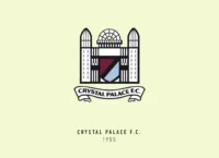
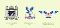
Crystal Palace may sound like the name of a chic resort or restaurant, but it was an actual building in London’s Hyde park constructed in 1851. The club pays tribute to its namesake building by having the structure in most of their crests, including the current one.
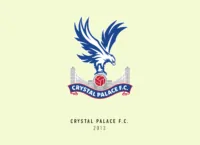
Crystal Palace FC would also heavily feature an eagle, based on their nickname “The Eagles”. When it comes to the number of things to be found in their crests, Crystal Palace have had a surprisingly few.
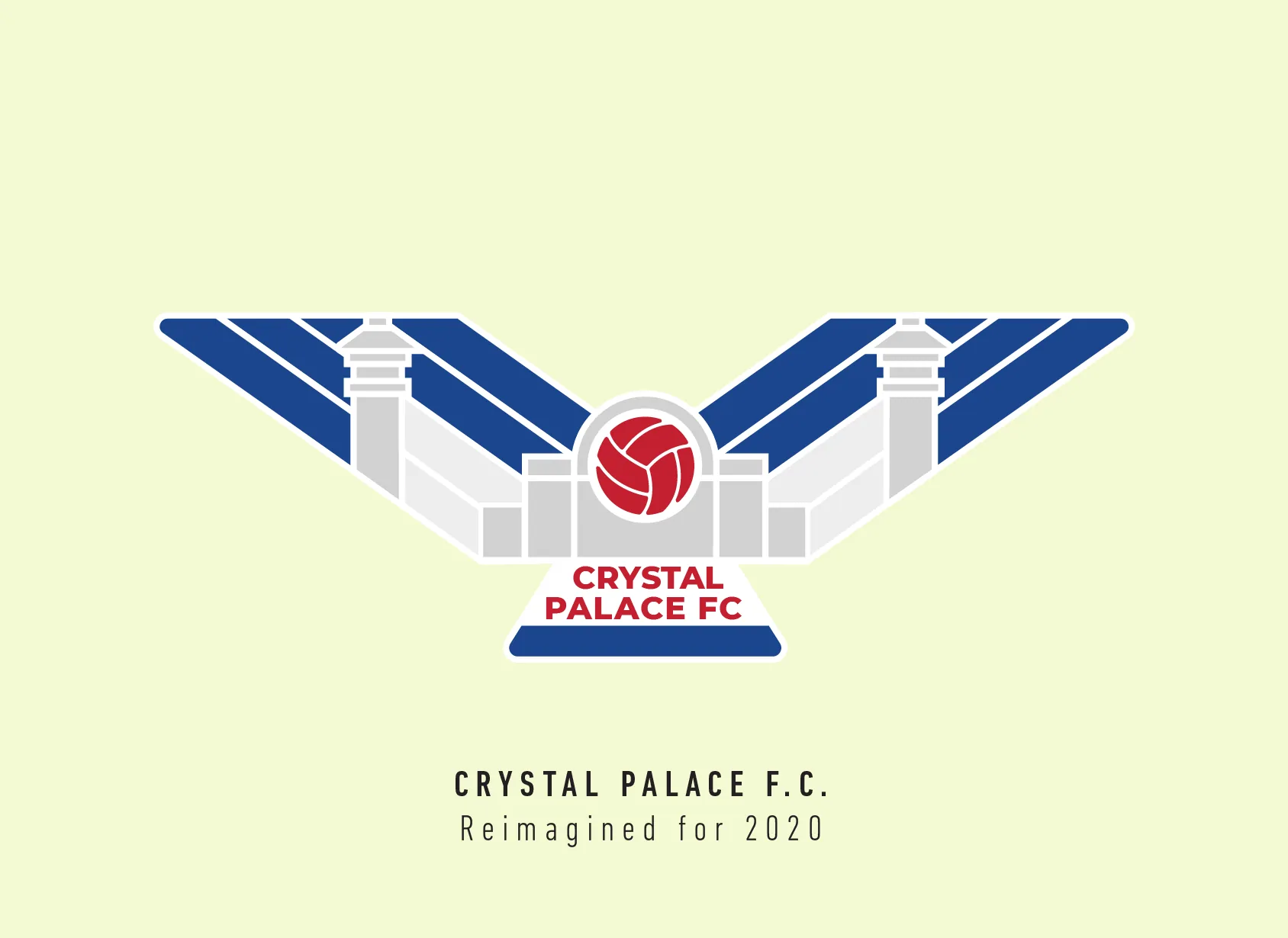
Most of their crests have had just a football, the eagle and the Crystal Palace building. The current crest has a nice modern stylized version of these three, along with their name on a banner.
I knew I was going to include the Crystal Palace Building and started with researching it and trying to simplify it as much as I can. I didn’t want to show each frame in the building like the current version as it was way too much detail. Once I got the basic shape, I fit the football in the centre of the building.
I took the same ball from the current crest. I saw how wide the crest was and thought about balancing it with putting the wings of the eagle above it, but soon realized it would be too much. So, I used the building to make it into an avian shape. I framed the text to represent the tail of the eagle to make sure everyone gets that it’s the bird.
I had to zoom in and out quite a few times to check if the shape still works. The colours were tough, I couldn’t use the blue and red on the building as it was supposed to be a crystal building, the colour just felt wrong for it. I took the grey from the original logo and made it a shade lighter, just enough to distinguish it from the white.
Sadly, most of the Crystal Palace building was destroyed in a fire in 1936. But Crystal Palace FC continues its legacy by carrying on its name and memory in their crest. That is why I wanted the main focus to be the building, not the eagle.
This article is part of the Premier League 2020 Crests series.
Shadab Wajih is an award-winning art director, graphic designer and an illustrator based in Miami, US. Besides his design and advertising work he also prides himself in his FIFA managerial skills. You can see more of his work, contact or complain to him on his Instagram: @snikt13
Add Sportslens to your Google News Feed!