There are football clubs, all around the world, who have strived to make their crest’s simpler, limiting it to 2 or 3 colours at the most. Think Juventus’ clean black and white, or Manchester United’s bright red and yellow, or how about Celtic FC with just green and white.
And then there is Southampton FC, which just rebelliously ignored all those unspoken rules and included all the colours mentioned above, plus more!
Southampton FC formed in 1885, as a church football club named St. Mary’s Church of England Young Men’s Association. Fortunately, they never decided to put their full name on the crest. In fact, they hardly put any text at all.
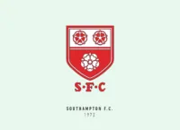
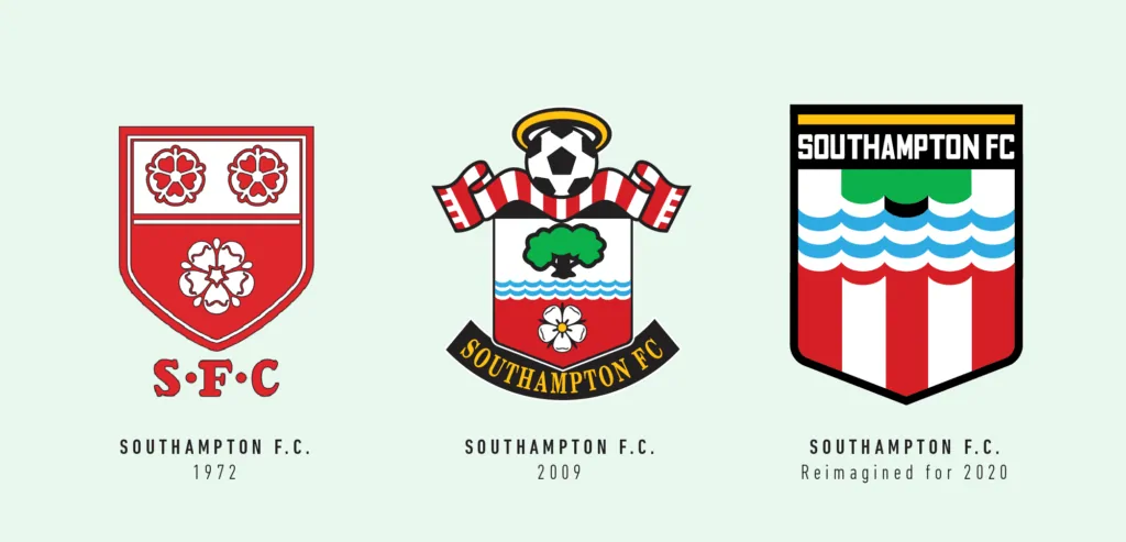
Like many clubs did after their inception they used their city’s coat of arms until 1973 when they organised a competition to design their brand-new crest, which was won by a Rolland Parris and used for 20 years. The world would be a much more peaceful place if all football crests were decided by competitions. On second thought it would probably be the opposite.
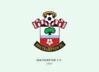
That crest was basically the same one we see today, with surprisingly very few changes made in the years to follow. There is the golden halo, a reference to the nickname “Saints”, a red and white scarf defining the team colours and representing the fans, the tree represents the nearby New Forest and Southampton Common and the water representing Southampton’s connections with the rivers, seas and oceans (Both the Mayflower (in 1620) and RMS Titanic (in 1912) set sail from the Southampton port).
Then there is a white rose – the symbol of the city which is also present on the city coat of arms, and in every other English football club crest. There is also a football, just to avoid confusion about the F in Southampton FC.
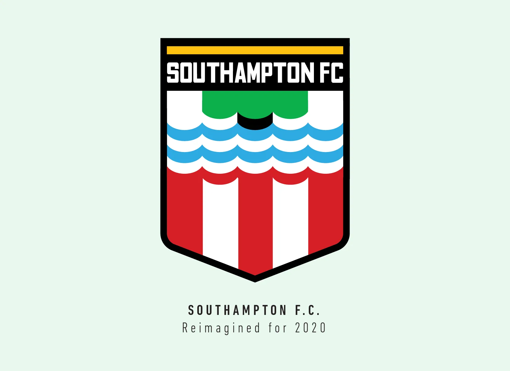
When I redesign these crests, I try my best to keep the most important elements still in there, as that’s what helps maintain the club’s legacy. In this case, I decided from the start, that maybe the football wasn’t that necessary. I started with redesigning the water pattern from the original crest, just simplified.
The water easily translated to the tree, and I was glad I could reduce it to such a simple shape. The curves of the water pattern defined the curves of the red and white scarf, and it also slightly reminded me of the shirt with its sleeves and collar, could be a stretch though.
I almost didn’t include the halo, but it would’ve been really unfair for “The Saints” crest to not have any reference to the title. Plus, the yellow really balances it out. I would be lying if I said I really tried to include the white rose but having seen a rose or another royal flower in every second English football crest I just figured the crest would be more unique without it.
And finally, the shield shape may seem new to some, but it’s taken directly from the original and serves as the perfect package for all these elements.
The Southampton redesign crest might be my favourite so far, the separate elements just fit so seamlessly with each other. It’s rare for a football crest to have so many colours for whatever reason, but I feel the Southampton FC crest is good inspiration to break that little tradition.
This article is part of the Premier League 2020 Crests series.
Shadab Wajih is an award-winning art director, graphic designer and an illustrator based in Miami, US. Besides his design and advertising work he also prides himself in his FIFA managerial skills. You can see more of his work, contact or complain to him on his Instagram: @snikt13
Add Sportslens to your Google News Feed!