Some of my closest friends are supporters of Manchester United FC, and they share the sentiment with millions of other Manchester United fans when they claim that the crest played a big part on why they fell in love with this club.
This is the power of a crest as elegant and imposing as that of Manchester United’s.
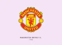
Manchester United FC was formed in 1878 as Newton Heath LYR Football Club. They changed their name to Manchester United in 1902. The famous nickname “The Red Devils” was introduced by Sir Matt Busby.
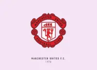
During the same era, we saw the devil make his debut appearance in the club crest in 1973. Another prominent element of the Manchester United crest is the ship with full sails, which is inspired by the Manchester Council’s coat of arms.
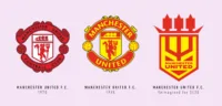
Since then the crest has gone through various but minor changes. The most important one being getting rid of the words “Football Club”.
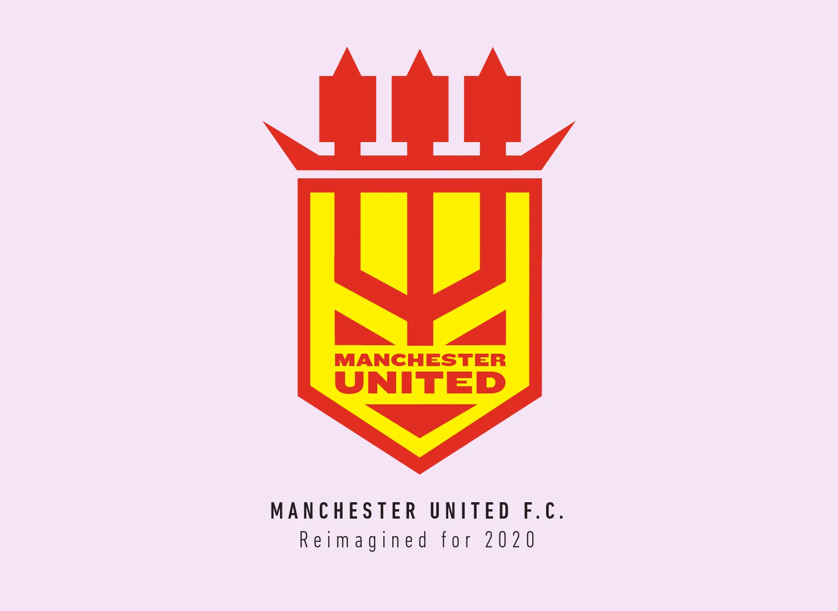
I think the crest I redesigned for Manchester United FC might be the only one where I kept all the elements from the original. Well, almost all of them; the banners and the football didn’t seem that important to me.
I started with plucking out the shield shape, which was almost the same as the first crest the club had when they were still called Newton Heath. I figured the ship has these 3-pointed sails, which are very similar in shape to the tips of the pitchfork. So, I started by putting just the pitchfork and extending to the sails of the ship.
It was simple enough, but then I realized the front and back of the ship can be made more angular to represent the devil’s horns. I added the smiling face of the devil because it fits really well with the pitchfork design. I used a very wide font and emphasized the word “United”, as the word “Manchester” already was shared with another very familiar club.
What I got was this super pointy crest, which seemed to me fit well the whole “Red Devils” moniker. Manchester United is one of those clubs which most people love to hate, and I feel this crest just seems to laugh at all of them, priding itself in its illustrious legacy.
This article is part of the Premier League 2020 Crests series.
Shadab Wajih is an award-winning art director, graphic designer and an illustrator based in Miami, US. Besides his design and advertising work he also prides himself in his FIFA managerial skills. You can see more of his work, contact or complain to him on his Instagram: @snikt13
Add Sportslens to your Google News Feed!