Every English football club has nicknames for its fans or the team itself. Some are okay, like Chelsea’s “Pensioners” and then there are the really cool ones, Like Manchester United’s “Red Devils”. Probably up there in the upper echelons of cool nicknames are “The Blades”.
The nickname might be great, but it didn’t always belong to Sheffield United exclusively. They had to share the nickname “Blades” and “Cutlers” with their fierce rivals Sheffield Wednesday. Sheffield United FC was founded in 1889 as an offspring of the Sheffield United Cricket Club.
They fought for the ownership of the nicknames for years until 1907 when a newspaper cartoonist depicted Sheffield Wednesday from Owlerton as an owl and Sheffield United as a blade. Well, that settled it, apparently.
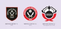
The reason I’m talking about Sheffield United’s nickname so much is because it ended up being a major part of their identity since then. It was featured prominently as part of their crest throughout their history.
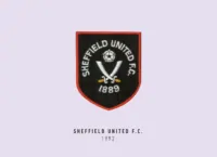
Of course, they started off by using the city of Sheffield’s coat of arms from 1965, until a new crest appeared in 1977. This was the origin of the crest we see today, consisting of two white crossed swords, or blades (see what they did there?), and a Yorkshire Rose.
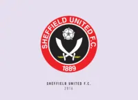
It also simplified it to the primary colours of red, black and white. This crest was apparently designed 20 years previously by former player Jimmy Hagan and is pretty much the same crest we see today.
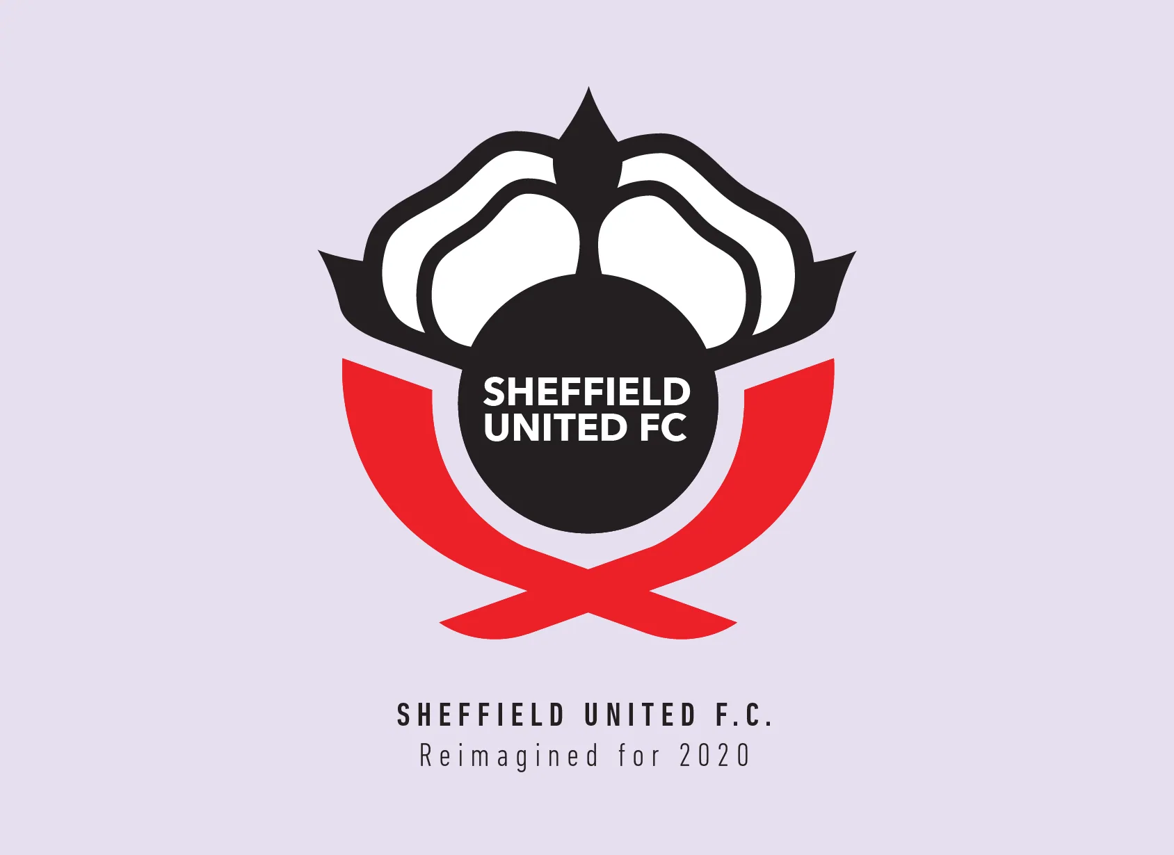
I started with a very resolute decision that I’ll be using the blades as the iconic circle frame of the original crest. I overlapped the circles to create very minimalistic blades, opting to remove the hilts leaving just the blades.
Normally I would’ve removed the Yorkshire rose as it is repeated on other English club crests too, in an effort to make it more unique. But this time I thought along with the blades I can maybe try to resemble the round shape of the original slightly. Taking just the top of the rose and aligning it with the blades definitely did make it seem more of a unit but it wasn’t enough.
The solution came in the form of the circle that already existed in the Yorkshire rose. I used it as the space to write the name and got rid of the date, to divert all attention to the name of the club.
Now that Sheffield United FC is back in the Premier League, and it looks like they are here to stay, it’s only fitting their new logo should look bold and unique, or my version of it anyways.
This article is part of the Premier League 2020 Crests series.
Shadab Wajih is an award-winning art director, graphic designer and an illustrator based in Miami, US. Besides his design and advertising work he also prides himself in his FIFA managerial skills. You can see more of his work, contact or complain to him on his Instagram: @snikt13
Add Sportslens to your Google News Feed!