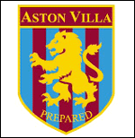
Aston Villa recently (well, a couple of weeks ago) revealed a new crest, going retro and against the grain as far as the current trend in the Premiership is regarding club crests.
It’s been bashed and liked on different forums – my view is that on its own the new Aston Villa crest looks just OK but when compared directly to the old Aston Villa crest, it’s definitely an improvement.
The new crest you can see above, here’s the old one:

Now obviously Aston Villa have invested time and money into this and have thought this through carefully, so I’m sure they have good reasons for going retro. I’d probably have done things a bit differently and kept the crest modern while removing the background and adding the star the way the new Aston Villa crest has, but to each his own.
It’s a decent crest, no doubt about it.
Also see: 2007/2008 Premiership Kits and our football kits section.
Add Sportslens to your Google News Feed!