Few rivalries are as close to each other as the Manchester derby. Today we talk about the so-called noisy neighbors, and their impressive crests.
Manchester City FC was formed in 1880, then known as St. Mark’s (West Gorton). They soon adopted the name Ardwick Association Football Club in 1887 and later changed it to Manchester City in 1894.
The club has found incredible success and dominance after being bought by the City Football Group, a move that has reflected in their crest and colours too.
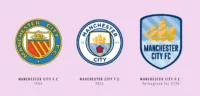
For most of Manchester City’s history, they have used the Manchester coat of arms as their badge. After using it for 70 years they changed it to a round crest featuring similar elements as the coat of arms.
They switched to a new badge in 1997 which featured a shield and an eagle. It also featured 3 stars. While for most football crests the star symbolizes an achievement or a trophy, in this case, they were just used to make it feel more “continental”. This crest was abandoned and replaced with the now-familiar round one after Manchester City FC was taken over by the new owners.
The new crest bears a striking familiarity with other clubs owned by the City Football Group. Melbourne City FC and New York City FC share the same shape and colours as the current Manchester City crest.
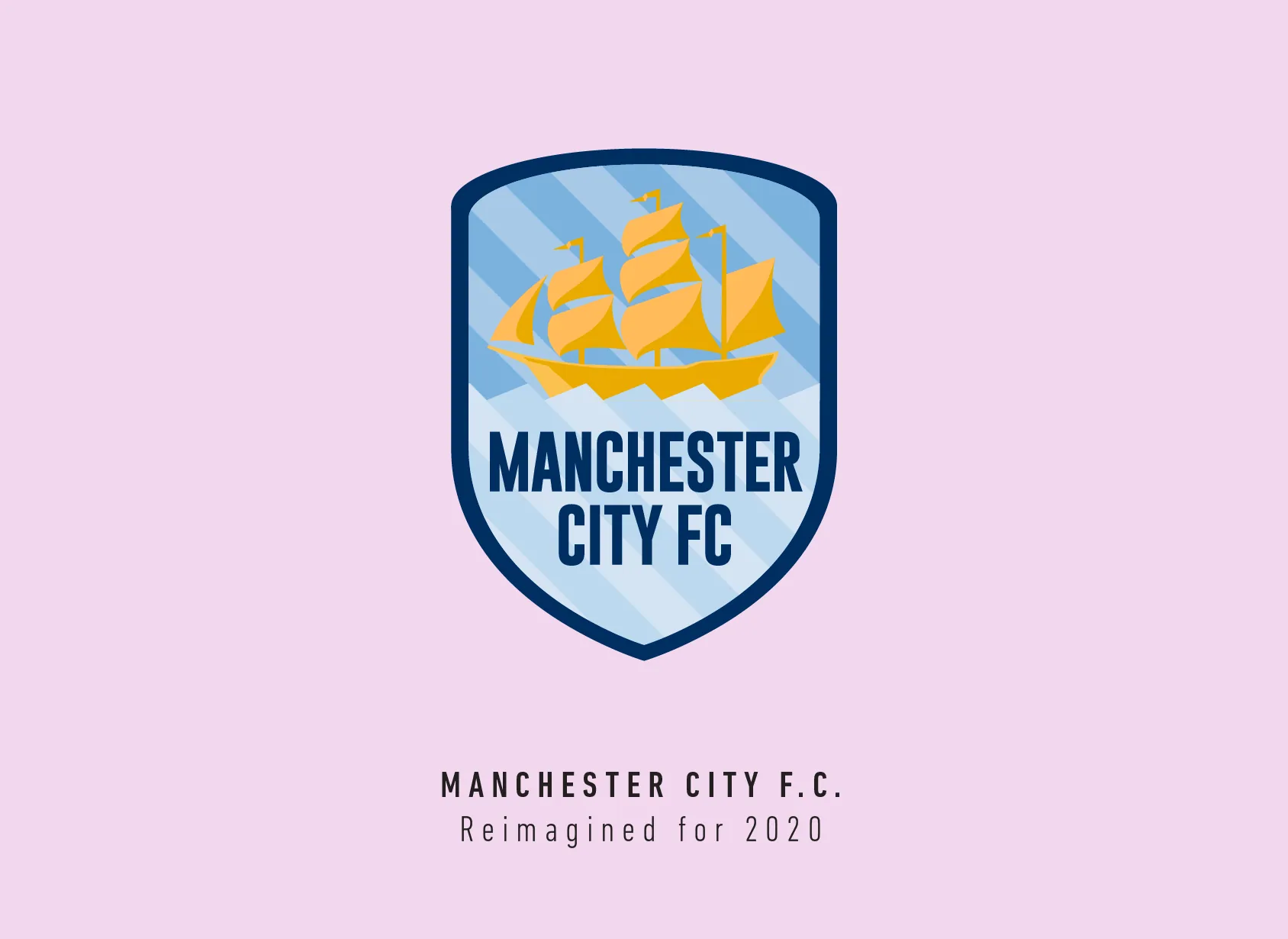
I actually love the current Manchester city crest, not sure how I feel about the intra-group branding the City Group has done with the other clubs though. In my opinion, a football club crest should be completely original and not be a part of a group.
So, the first step for me was to get rid of that circle shape and use just the shield shape within. The ship represents the Manchester Ship Canal. I figured I could manipulate the blue stripes below to look like the water and a different shade behind to show the sky.
I tried a variation with the sky looking darker than the water and the text would be white, it did look better on the crest but the name was hard to read.
This crest might be the simplest I’ve designed in terms of the story it tells. It’s simply a ship on the Manchester city canal followed by the name. Sometimes, less is indeed more.
This article is part of the Premier League 2020 Crests series.
Shadab Wajih is an award-winning art director, graphic designer and an illustrator based in Miami, US. Besides his design and advertising work he also prides himself in his FIFA managerial skills. You can see more of his work, contact or complain to him on his Instagram: @snikt13
Add Sportslens to your Google News Feed!