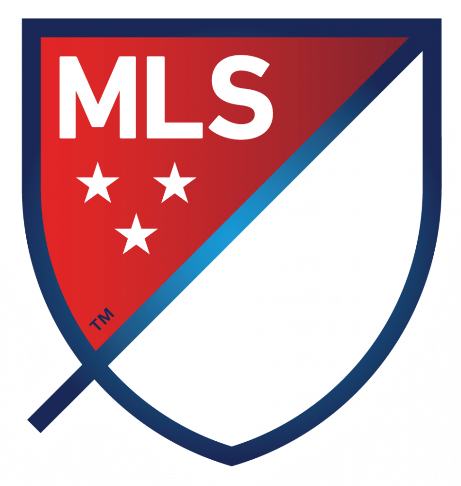
On Thursday Major League Soccer announced, that their clubs will all be able to take part with the new logo, as the symbol colors will adjust to the teams colors. Photo provided by Major League Soccer and USA Today.[/caption]
MLS kisses good bye to their past and introduces a new image for soccer in America.
On Thursday in New York City, NY Major League Soccer publicly unveiled the new logo for MLS going forth.
Since the league began in 1996 the logo was a soccer cleat kicking a ball, over time the colors of that symbol did change but the image itself was never tweaked. Now with the growth of soccer in the U.S. increasing rapidly, MLS felt it was ready for a more mature look. Something that does not scream, “This is where Americans play soccer,” but now in a creative way to capture the attention of an ever expanding pool of new soccer fans.
“The new brand’s design is intended to say “soccer” without the literal ball and cleat,” MLS stated in a press release. “In the end, we decided that the inclusion of a ball and cleat is unnecessary as it dates us very quickly (due to the fast pace of innovation in our game) while many other ways exist to signal we are a soccer league. Our new brand will build meaning over time so that our new crest signifies soccer in North America and has a unique place in global sports.”
The new symbol for Major League Soccer is a shield, which appears to look very similar to the National Football League and National Hockey League symbol. The name is on the top left hand corner, where “MLS” is engraved. Under “MLS” there are three stars which represent: “for country, for club and for community.” The dash coming across the shield is what represents the first and the second half of the beautiful game, according to the press release.
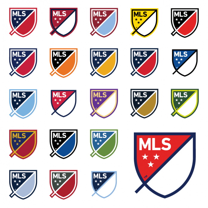
However, there are no set colors for this new logo, as each team in MLS will have the crest on their uniform and the colors of the club will dominate how the shield looks. Though for all the teams that currently playing in Major League Soccer in 2014, they will not change to the new crest till 2015 in March during “jersey week.” As for New York City FC and Orlando City Soccer Club, their uniforms will already have the new crest before the end of the year, according to the press release.
“It means each club will get a version of the league crest, which better reflects their clubs identity and local market,” the Major League Soccer press release states. “This is not a replacement for the club brand; instead the new league brand compliments and allows the club to be the real hero. We want to reinforce the ethos of the new brand, which encourages clubs to “own” and adapt the crest to match the colors they and their fans associate with and support.”
Though the league itself will not drastically erase the old logo by this weekend matches. Instead their goal is to steadily have the new logo come into picture and by the 2015 season the old logo will be history.
“The new MLS brand will begin to appear in 2015-related programs and products this fall and will be fully launched at the MLS Combine and SuperDraft in January 2015,” the MLS press release stated.
Major League Soccer is approaching their 20 birthday, and Commissioner Don Garber and the rest of MLS believe it is the time to change. Whether the new logo is liked, it is clear that there will be more changes to come for Major League Soccer, and soccer fans in America should be excited for what lies ahead.
Add Sportslens to your Google News Feed!