“Nil Satis Nisi Optimum”. “Nothing but the best is good enough”. Words to live by, especially during the transfer market period.
Everton FC was formed in 1878 and is the second-longest continuous serving club in English topflight football. The Toffees have seen quite a lot of success during their time, winning the league nine times and the prestigious FA Cup five times.
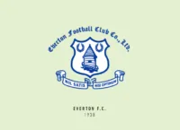
The design of the first version of their crest will have to be credited to then Everton secretary Theo Kelly, who was tasked to design a necktie for the club. They had agreed to use blue as the main colour and after working for four months on it, he decided to make it based on the local Prince Rupert’s castle, also known as the Everton lock-up. The rest is history.
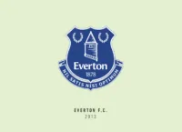
The tower has featured prominently on many of their crests since, including the current one. There is also the case of the infamous redesign of 2013. The club’s administration decided to modernise the crest and trimmed out some of the elements like the double wreath and the banner featuring the club’s motto.
It’ll be an understatement to say the fans weren’t happy. A fan website polled 91% against the new crest and a petition to change it was begun. 22,000 signatures later the club resorted to a compromise by redesigning the crest again and bringing back a lot of the previously removed elements.
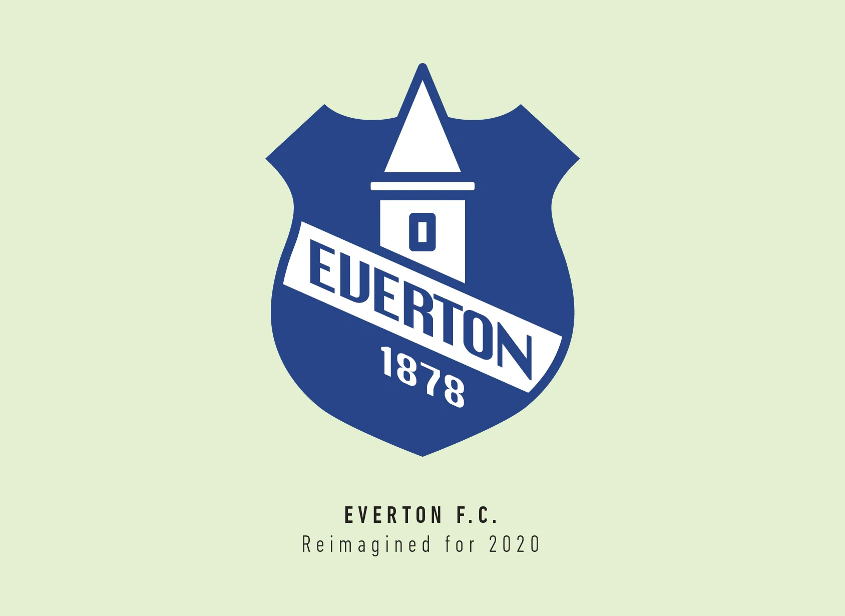
Now if you think I learnt a lesson from that debacle, I didn’t. I did try though, honestly, to include the double wreaths and the banner but there just wasn’t enough room. I started with the very distinct shield shape of the current Everton crest.
I wanted to integrate the Everton name into the tower, so I shaped it like the spiral staircase that goes around the tower. I also kept the date to further extend the tower below the text.
I did have a look at the photos of the actual tower and it looks nowhere as tall as the Everton crests would lead you to believe, but I didn’t want to be the one to break that tradition and I was inspired by the previous crests more than the actual photos.
I’m sure, as the recent past clearly shows, most supporters would hate any changes on their beloved club crest. On the one hand, I get it, being a die-hard supporter of a Premier League club myself. On the other hand, I have seen older versions of my club’s crest and felt it has greatly improved through the years.
Maybe it’s just a matter of getting used to it and accepting change as a good thing? One thing’s for sure, Evertonians should be proud that their club does listen to them and takes their thoughts into consideration when it comes to major changes like these.
This article is part of the Premier League 2020 Crests series.
Shadab Wajih is an award-winning art director, graphic designer and an illustrator based in Miami, US. Besides his design and advertising work he also prides himself in his FIFA managerial skills. You can see more of his work, contact or complain to him on his Instagram: @snikt13
Add Sportslens to your Google News Feed!
